PROJECT 1: DIGITAL TYPOGRAPHY COLLAGE POSTER
Description:
from “A” to “Z”. The composition must include all 26 letterforms in an18” x 24” format, vertical or horizontal. The letters can be presented in any arrangement responsive to your concept. You may use any “style” of a single typeface. So, for example, you could spec Garamond, demi-bold, lowercase,italic. FYI, Garamond is the typeface, demi-bold, lowercase, italic define the
font. Use only “classic” typefaces. Review and utilize visual principles and relationships in your composition.
Conceptual & Aesthetic Direction:
Students were to produce an 18” x 24” typographic composition that presents the alphabet in a unique, creative, witty, inventive, rebellious way. Making it ownable, collectable and readable from a range of viewing distances. Thinking of the poster as a homage to a particular typeface. Letting the typeface and font dictate the aesthetic treatment.
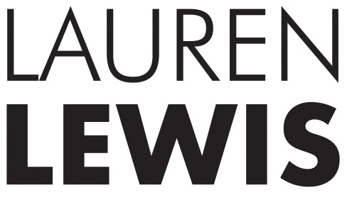
Megan Haase
Font: Classic Grotesque
Aesthetic Direction: Swiss/International Typographic Style
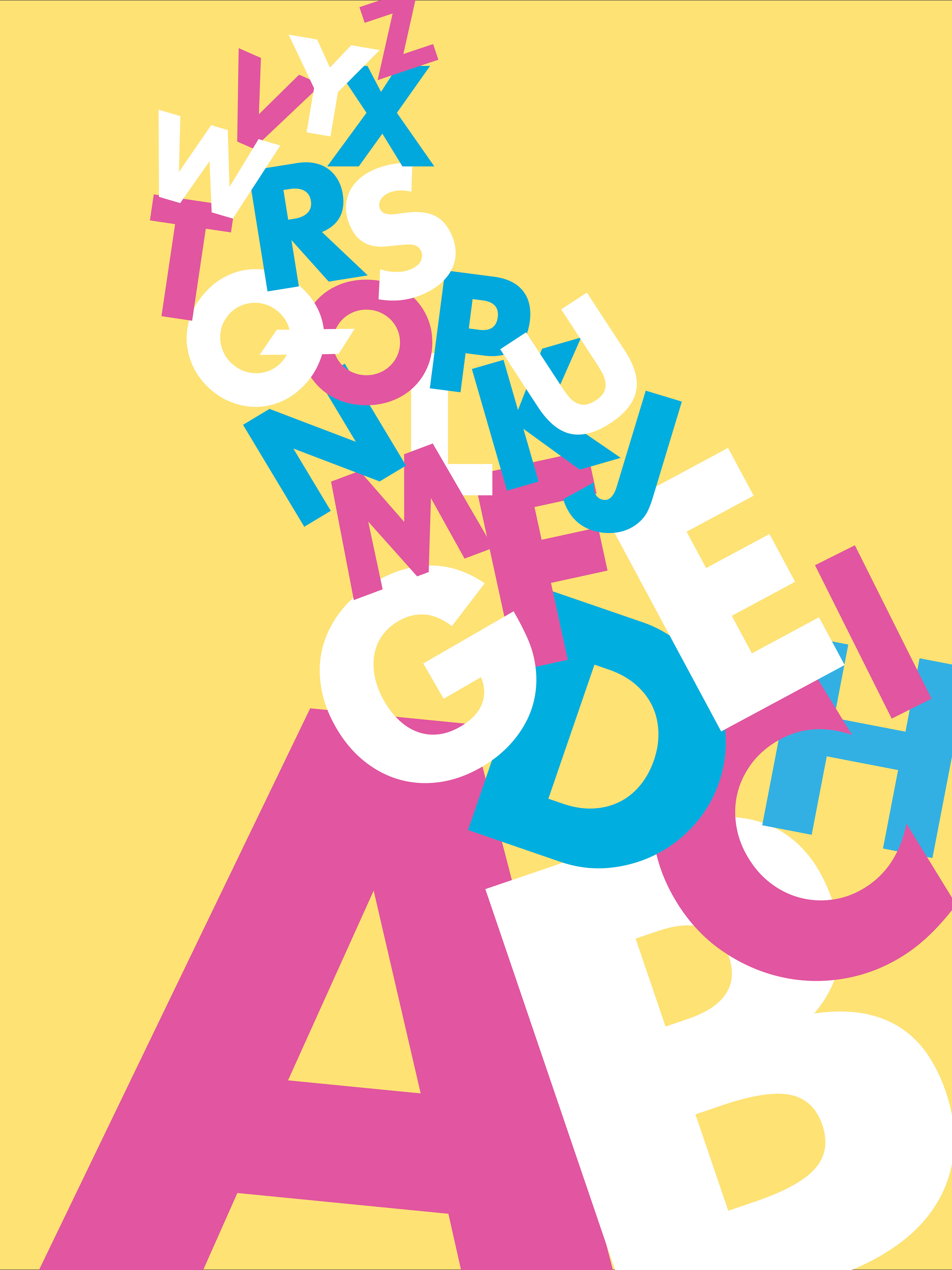
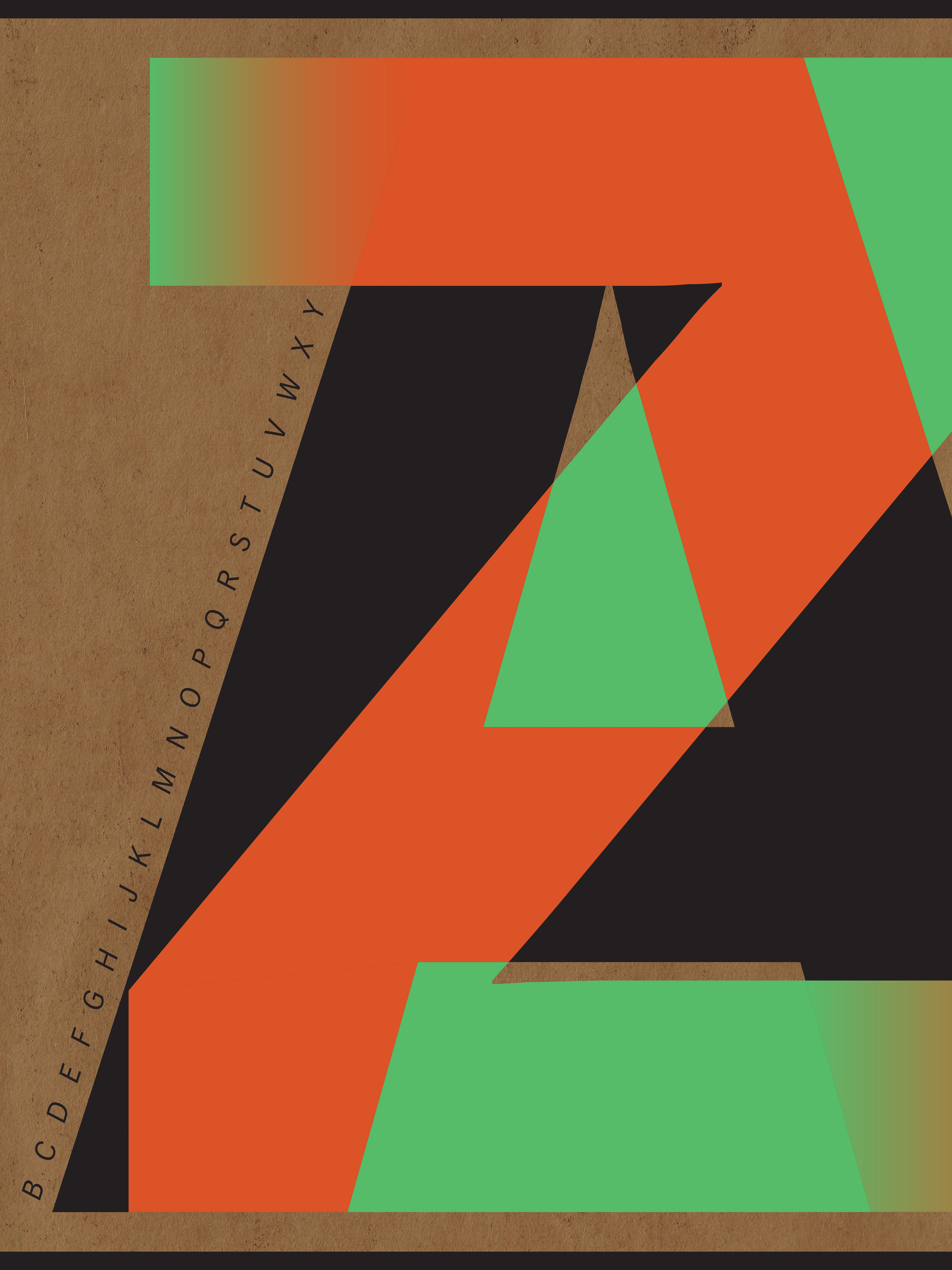
SOPHIA VELASCO
Font: Futura Bold
Aesthetic Direction: Post-Modern Style
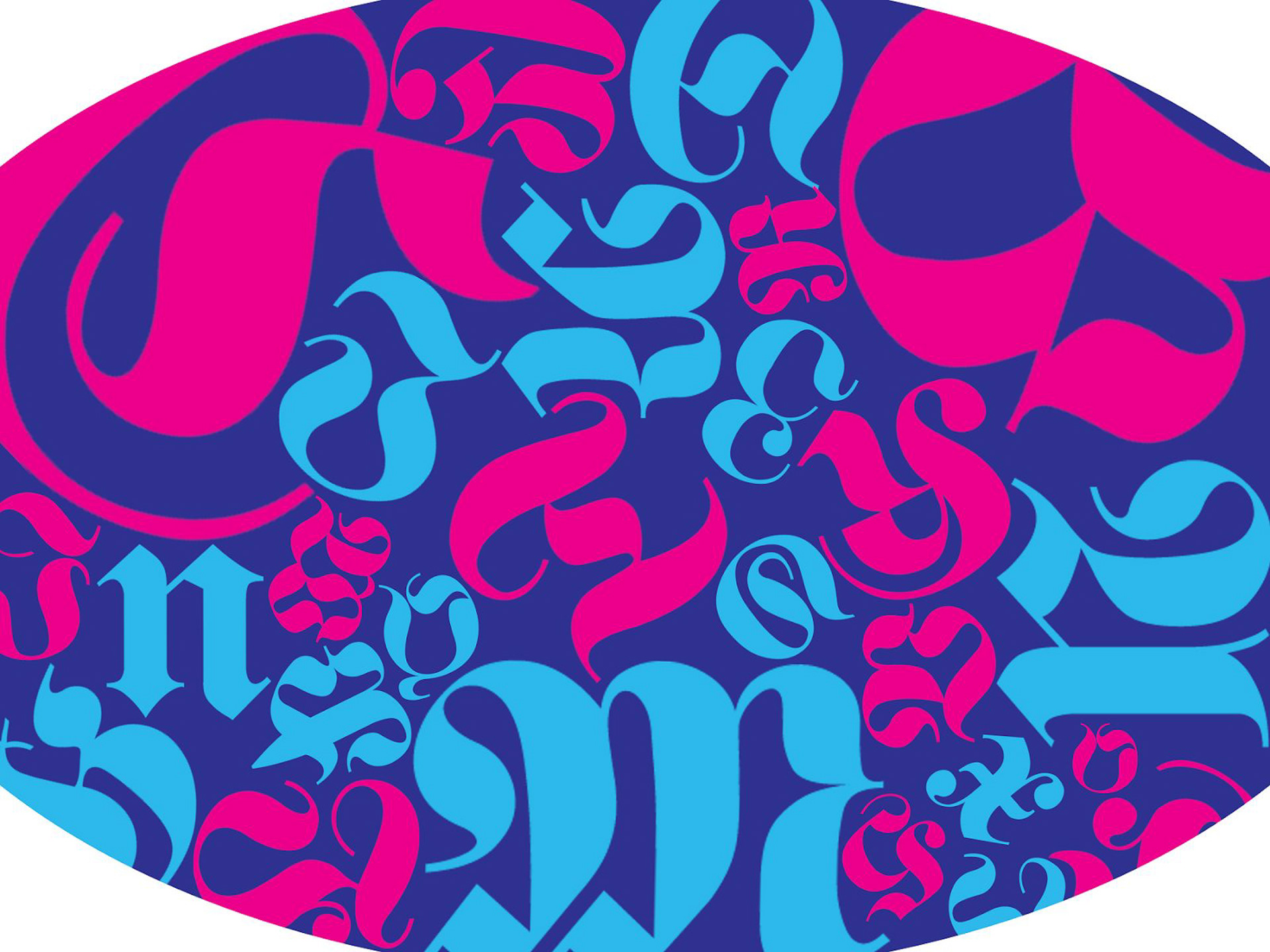
Emily Tellagrio
Font: Fette Fraktur
Aesthetic Direction: Psychedelic Style & Astronomy
inspiration
Artists and designers have been using type as content for centuries. In the 20th and 21st centuries, type as form and alphabets have been the subject for compositional exploration and experimentation.