PROJECT 5: TYPEFACE DESIGN
Description:
Type design is the art and process of designing typefaces. It is often used synonymously with the term “font design”; technically, font design is the rendering of a typeface design into an entire available family of keyboardable characters, while typeface design is the shaping of individual glyphs, with an eye to the eventual incorporation as a font. A typeface differs from other modes of graphic production such as handwriting and drawing in that it is the mechanical storage and dispensation of alphanumeric characters. Each of the characters is stored in a master archetype form and then a user, by means of hand picking (handset metal
type), a keyboard (linotype and desktop publishing) or other means selects individual characters to “set” into the text.
Conceptual & Aesthetic Objectives:
Take a material (paper, tape, ribbon, etc.) of some sort and use that specific material to create a typeface. The typeface must be comprised of all of the letters of the alphabet (A-Z). Choosing one, Caps or lowercase. You do not need to create both.
When the whole alphabet (A-Z) is created trace the outline of each letter and then scan the outlines to render and adjust the letters to match each other in Adobe Illustrator. Meaning, the baseline, cap-height, x-height, ascenders, descenders, set width, counters and terminals all need to be consistent throughout the entire typeface.
Glue or pin all of the letters A-Z on a piece of foam core board (horizontal or vertical composition). Once the letters have been rendered in Adobe Illustrator, use the letters to form words based off a short quote that is inspiring or important. The final printed quote will need to be printed 16"x 20" or larger for final critique .
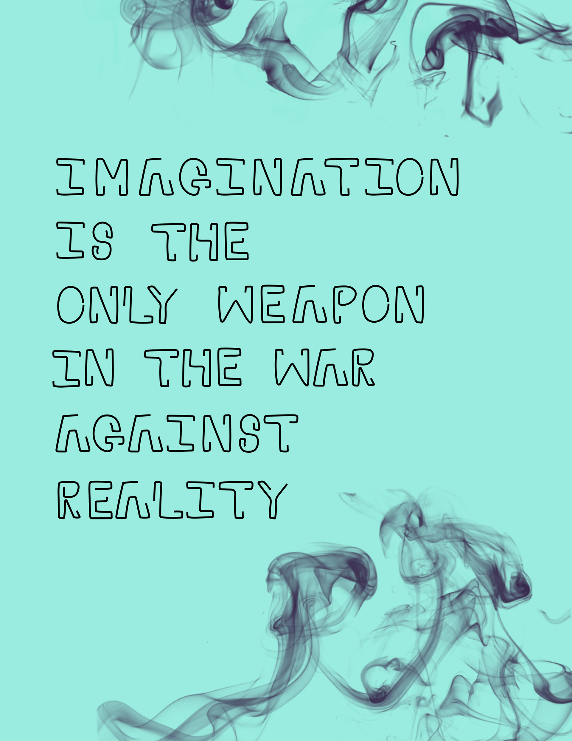
NOVEMBER HARDY
Material: Wire
Quote: "Imagination is the only weapon in the war against reality." - Lewis Carroll
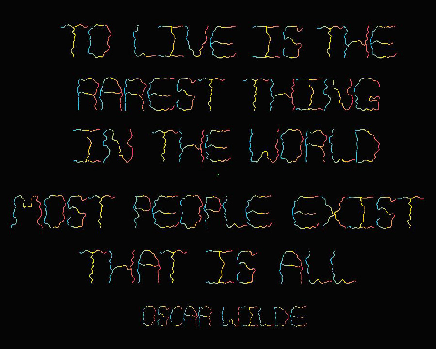
EMILY TELLAGRIO
Material: Knitting Yarn
Quote: "To live is the rarest thing in the world. Most people exist, that is all." - Oscar Wild
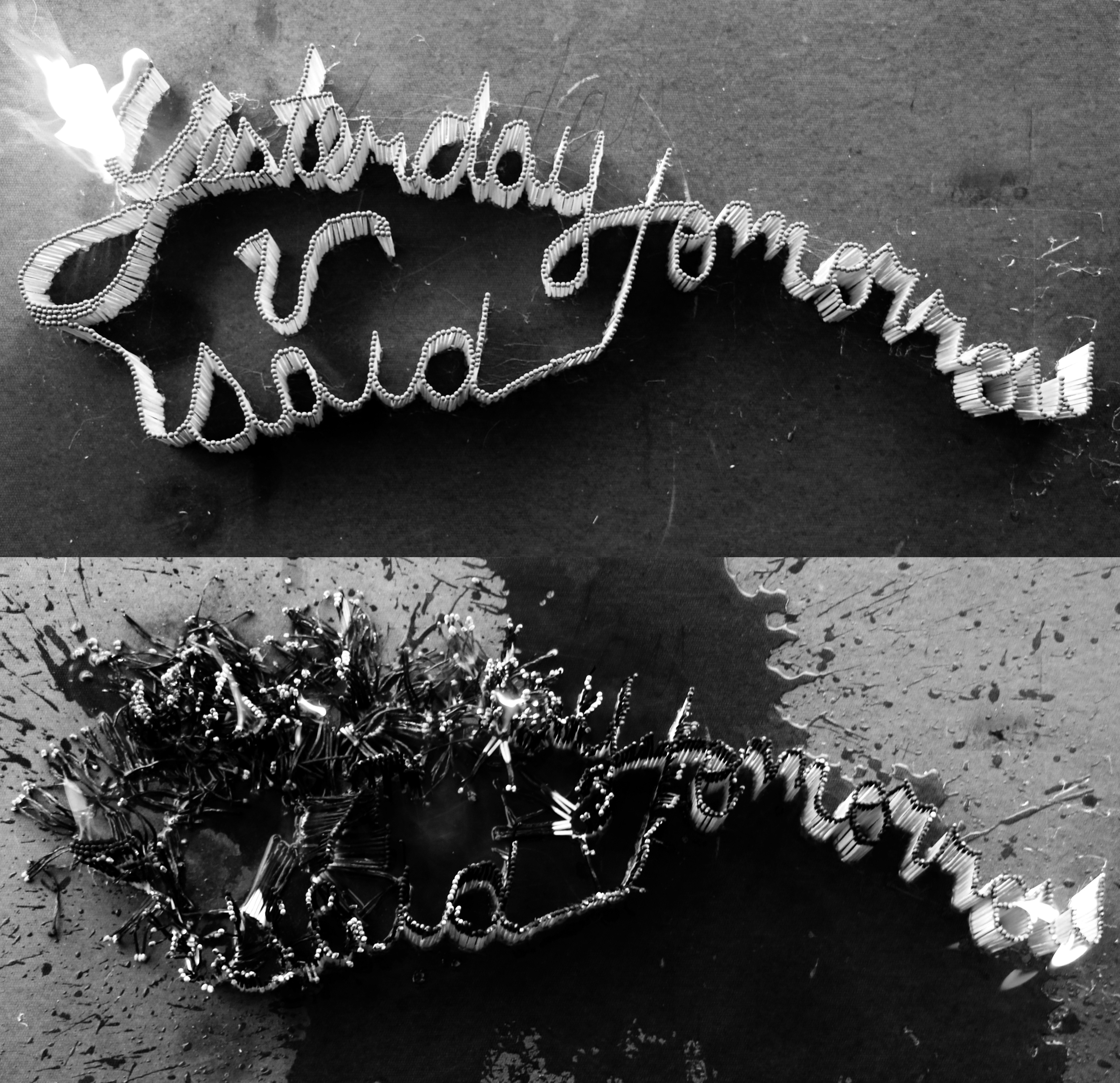
LEANN WAGERS
Material: Matches
Quote: "Yesterday You Said Tomorrow" - Unknown
A Brief History of Typeface Design
The technology of printing text using movable type was invented in China, but the vast number of Chinese characters, and the esteem with which calligraphy was held, meant that few distinctive, complete fonts were created in China in the early centuries of printing.
Gutenberg’s most important innovation in the mid 15th century development of his press was not the printing itself, but the casting of Latinate types. Unlike Chinese characters, which are based on a uniform square area, European Latin characters vary in width, from the very wide “M” to the slender “l”. Gutenberg developed an adjustable mold which could accommodate an infinite variety of widths. From then until at least 400 years later, type started with cutting punches, which would be struck into a brass “matrix”. The matrix was inserted into the bottom of the adjustable mold and the negative space formed by the mold cavity plus the matrix acted as the master for each letter that was cast. The casting material was an alloy usually containing lead, which had a low melting point, cooled readily, and could be easily filed and finished. In those early days, type design had to not only imitate the familiar handwritten forms common to readers, but also account for the limitations of the printing process, such as the rough papers of uneven thicknesses, the squeezing or splashing properties of the ink, and the eventual wear on the type itself.
Beginning in the 1890s, each character was drawn in a very large size for the American Type Founders Corporation and a few others using their technology—over a foot (30 cm) high. The outline was then traced by a Benton pantograph-based engraving machine with a pointer at the hand-held vertex and a cutting tool at the opposite vertex down to a size usually less than a quarter-inch (6 mm). The pantographic engraver was first used to cut punches, and later to directly create matrices.
In the late 1960s through the 1980s, typesetting moved from metal to photo composition. During this time, type design made a similar transition from physical matrix’s to hand drawn letters on vellum or mylar and then the precise cutting of “rubyliths.” Rubylith was a common material in the printing trade, in which a red transparent film, very soft and pliable, was bonded to a supporting clear acetate. Placing the ruby over the master drawing of the letter, the craftsman would gently and precisely cut through the upper film and peel the non-image portions away. The resulting letterform, now existing as the remaining red material still adhering to the clear substrate, would then be ready to be photographed using a reproduction camera.
With the coming of computers, type design became a form of computer graphics. Initially, this transition occurred with a program called Icarus around 1980, but widespread transition began with programs such as Aldus Freehand and Adobe Illustrator, and finally to dedicated type design programs called font editors, such as Fontographer and FontLab. This process occurred rapidly:
by the mid-1990s, virtually all commercial type design had transitioned to digital vector drawing programs.
Each glyph design can be drawn or traced by a stylus on a digitizing board, or modified from a scanned drawing, or composed entirely within the program itself. Each glyph is then in a digital form, either in a bitmap (pixel-based) or vector (scalable outline) format. A given digitization of a typeface can easily be modified by another type designer; such a modified font is usually considered a derivative work, and is covered by the copyright of the original font software.
Type design could be copyrighted typeface by typeface in many countries, though not the United States. The United States offered and continues to offer design patents as an option for typeface design protection.